Three Worlds, One Image: Alien Final Character Art

Making Of / 02 June 2022

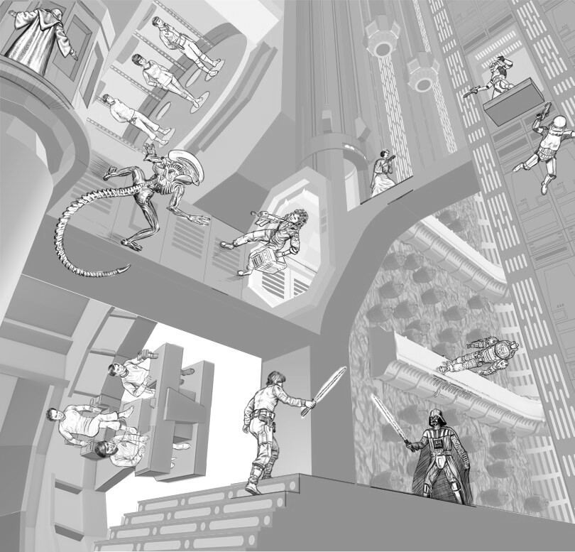
It had a taken a lot of preliminary work to develop a layout that put everything where it needed to be, so I was excited to get started on creating the final art for the characters.

The sketch phase gave me a clear idea of how I wanted the characters to look but it wasn’t all completely worked out beforehand. I like to leave some room for exploration in every phase of the process when I’m developing an image. When I first started working digitally, I’d tried to have everything completely mapped out in the final sketch but that had turned crating the final image into a tedious, almost “paint by numbers” kind of chore—it seemed like I was just mindlessly tracing over lines and coloring them in.

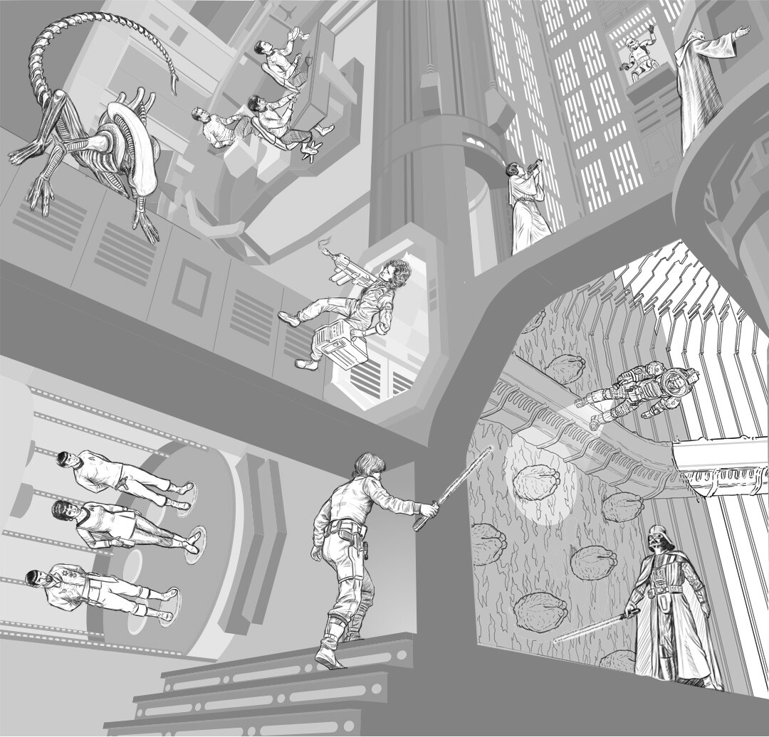
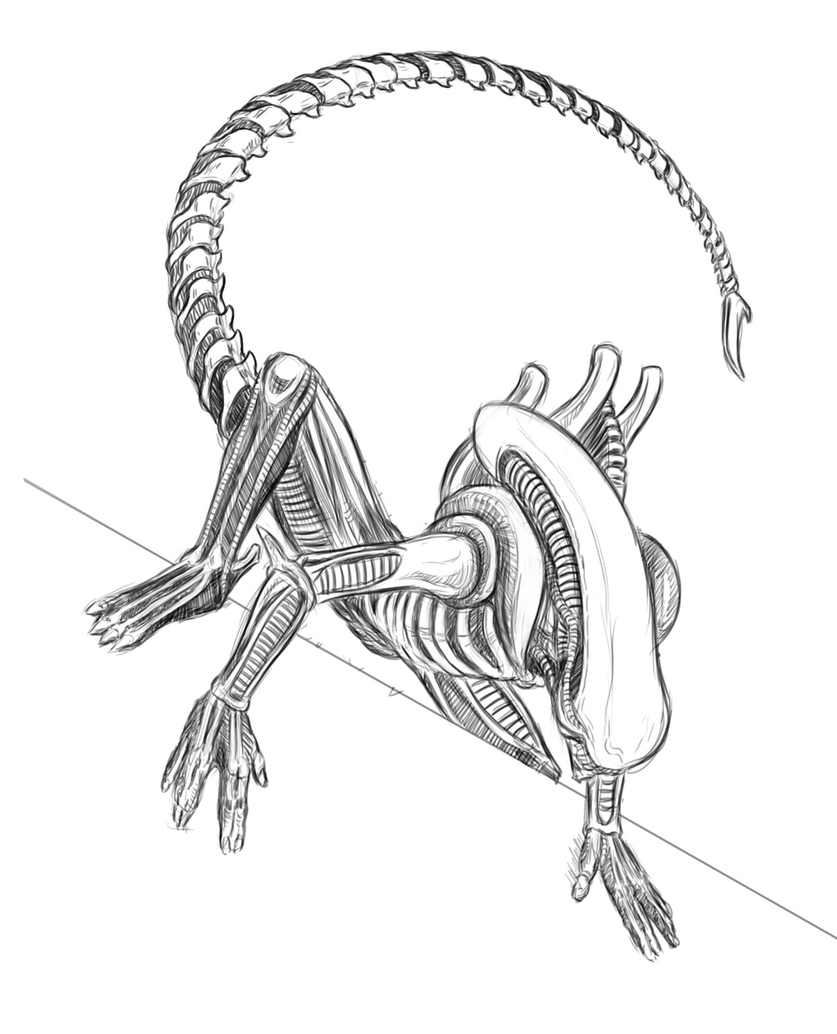
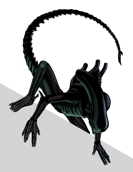
I’d recently started using dashed lines with uneven dashes and gaps to give areas some stylized texture or softened edges in assignments I was creating in Illustrator and I was looking forward to seeing how I could apply that technique to modeling the characters for this piece. I figured the best character to start on was the Alien—since it was going to be primarily in silhouette, a little modeling was going to go a long way and I could get an immediate impression of how well the technique would work without investing too much time and effort (in case it crashed and burned!)

After an hour, I knew I was going in the right direction—organizing the darks and lights into areas of relatively close tonal value helped to give the character volume and dimension while also maintaining the graphic, stylized look I was going for. I was able to quickly finish the Alien and get on to Kane in the egg chamber.

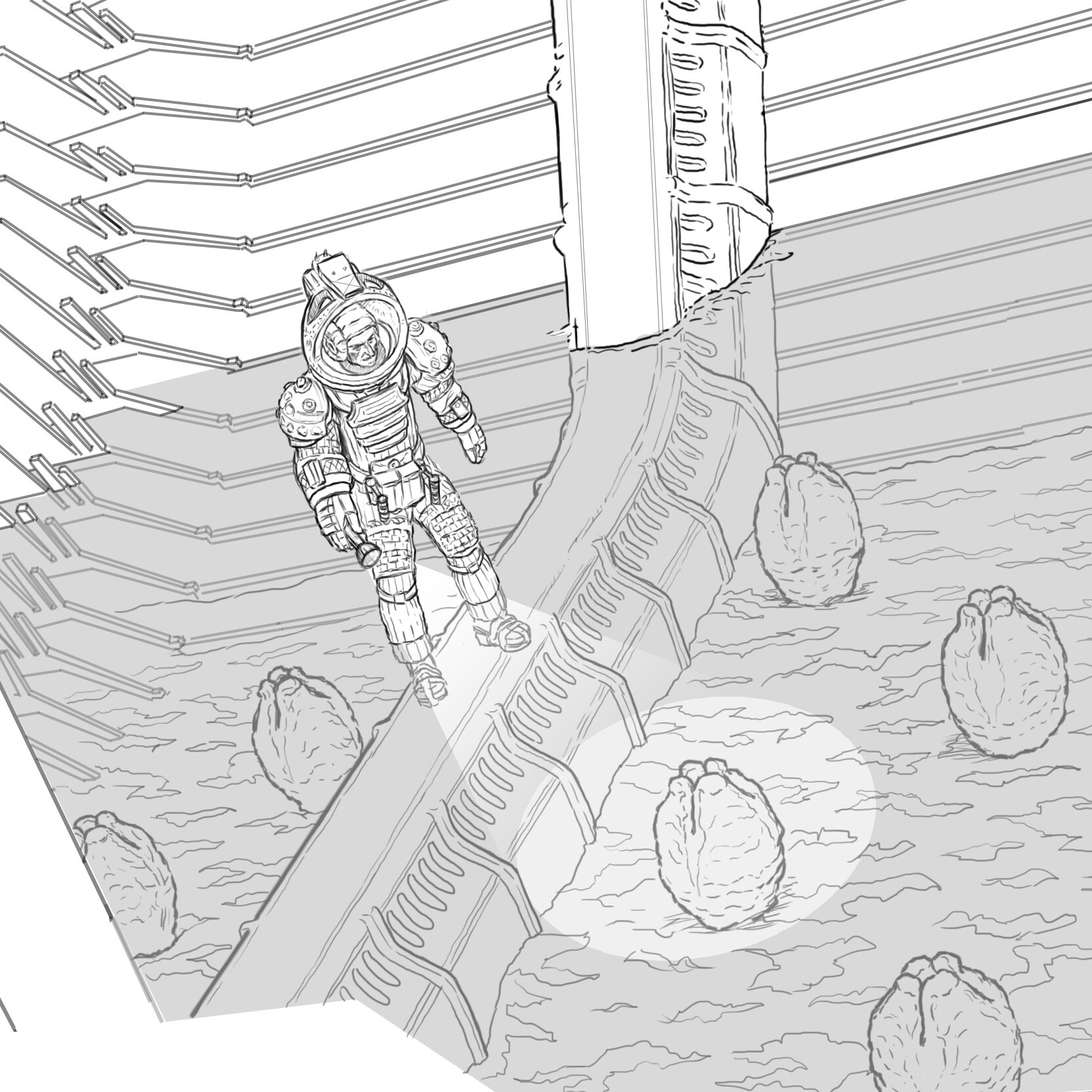
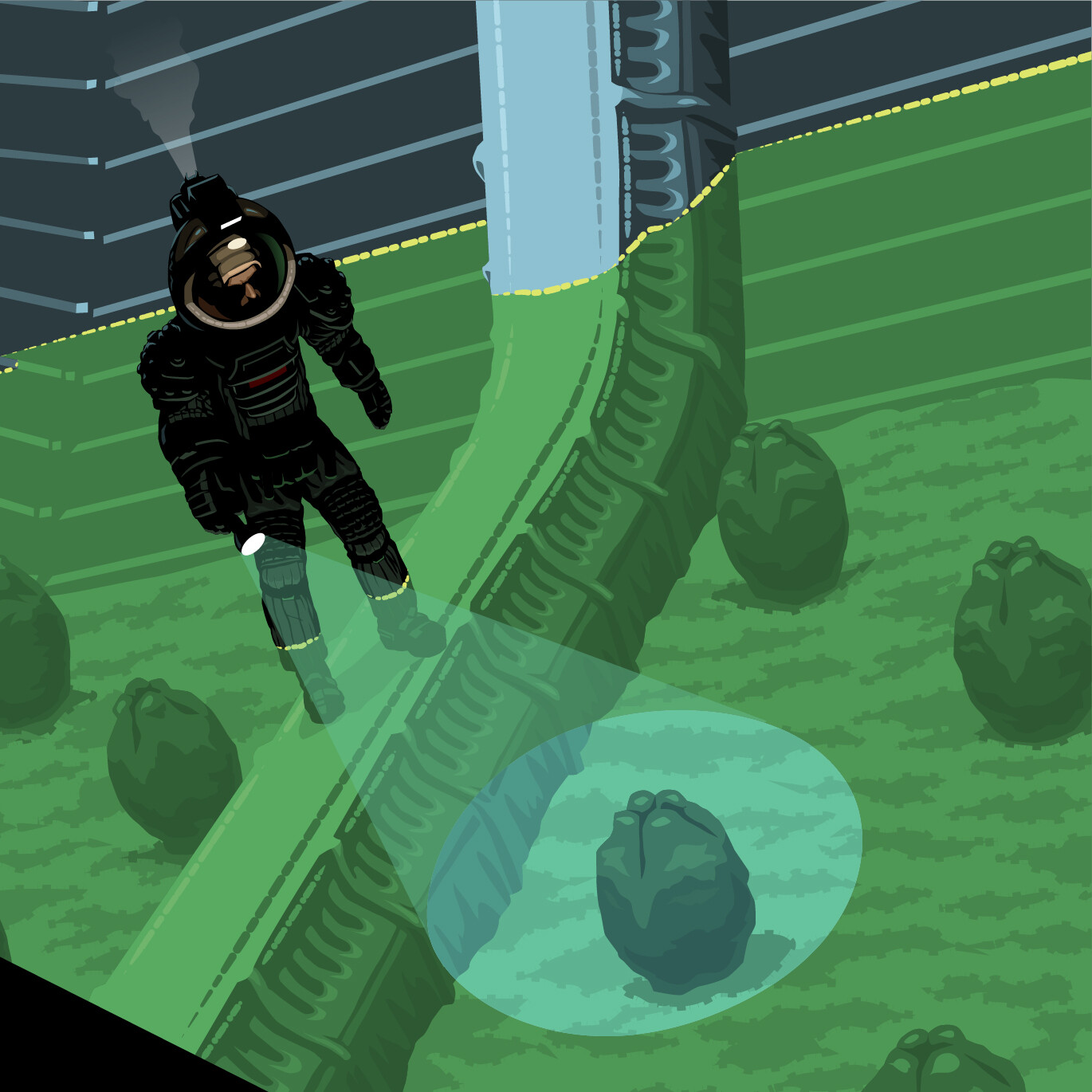
I was particularly looking forward to creating the final art for the egg chamber itself because I thought the uneven dashed lines could create some nice organic surface texture to the floor while still only needing to use 2 or 3 colors to do it. I still wasn’t sure how I was going to approach the interaction between the beam of Kane’s flashlight and the laser light surface above the eggs but I figured I would just figure that out while I was drawing it. Adding some transparency to the shapes creating the beam was all it ended up needing to feel like it integrated with the overall look of the image.

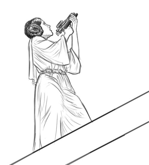
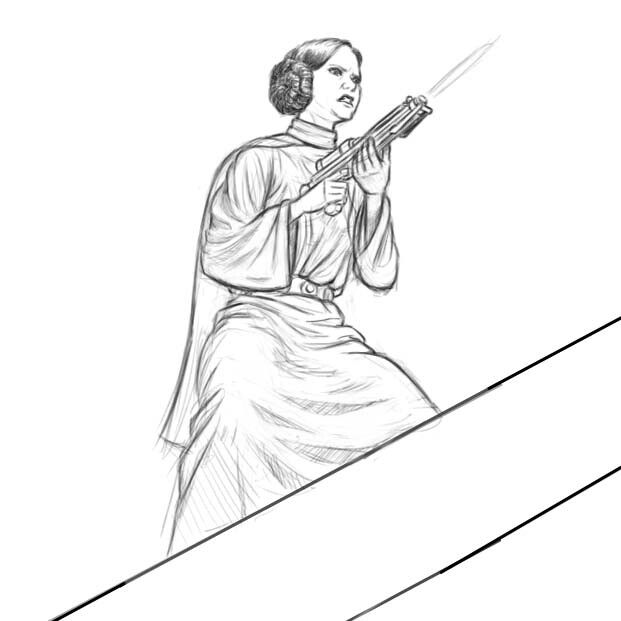
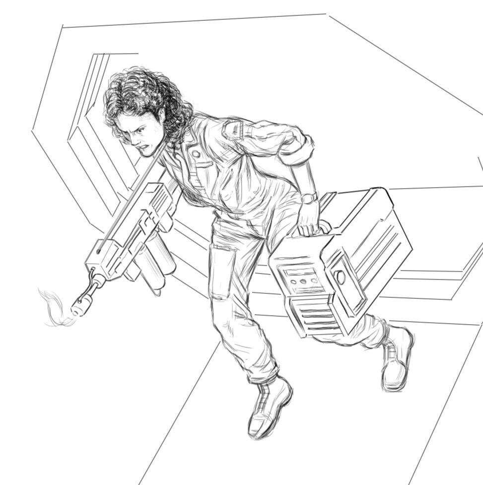
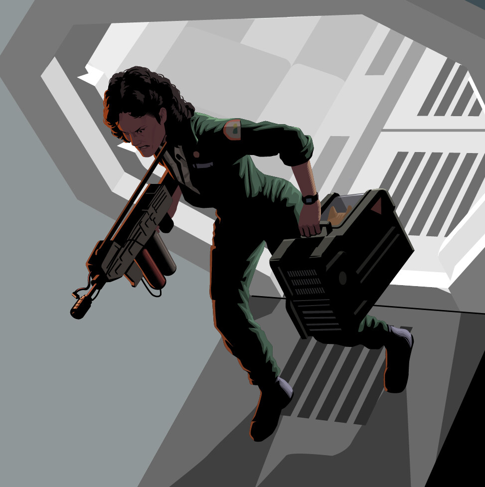
Ripley was the first “completely human” character I was going to work on—Kane was so obscured by his suit that I just had to add a hint of his face, but Ripley was going to be completely visible, though I still wanted to keep the overall tonal values dark. I’ve always thought of Alien as a horror movie so I wanted to keep the lighting on her as foreboding as possible. While Luke climbing the stairs is the figure I think leads your eye into the image, Ripley is the central figure and the point of greatest dark on light contrast, so it seemed to demand I add a lot of detail even though a lot of it might be “lost in the shadows”.

I worked on the characters at 4 times the size they would actually appear in the image which gave me a lot of room to add as much detail as was needed. I added each one to the final layout as I finished them, then got started on the Star Wars characters.

Report

BlenderNation's Best of Blender Artists

News / 27 May 2022

Alientrekwars was featured in BlenderNation's Best of Blender Artists this week!

BlenderNation's Best of Blender Artists

Report

Three Worlds, One Image: Final Layout With Figures

Making Of / 26 May 2022

Now that I had a full set of character sketches, it was time to add them to the final layout to make sure everything was working together.

This was fairly straightforward—the first attempt at the layout gave me a clear idea of the way everything was going to fit together this time around so adding the figures was just a matter of scaling and rotating them into their final positions.

Comparing the first attempt with the final layout made me feel like it had finally turned into a workable image. I liked the way the architecture and elements like the Alien’s tail led the eye around the composition. It had a nice visual rhythm and balance.

First Layout

Final Layout

Now I could get on to creating the final art for the characters.

Report

Three Worlds, One Image: Revised Star Wars Character Sketches

Making Of / 19 May 2022

With the exception of a minor scale problem, I already liked the sketch I had for Luke—Luke going up the stairs had been the initial image that had popped into my mind when I was first thinking about making this image and it was still the foundation that the rest of it seemed to be built on. While I liked Vader’s placement, I had second thoughts about the pose I originally drew him in—it was a bit too active and aggressive for the moment I was trying to capture from Empire Strikes Back. I needed him to be a bit more passive. Having him advance with his lightsaber lowered would not only serve the story better; it would also make it a bit easier to integrate this Star Wars part of the image with the Alien stuff that was going on behind it.

The character that gave me the most problems with coming up with the right pose was Leia. I knew I wanted her shooting a blaster, but the layout necessitated that she had to be firing upward at an extreme angle at a target that required her to almost be facing away from the viewer. I tried a number of different variations and ended up deciding that a profile was going to be the best pose I could put her in and still have her firing in the direction she needed to be firing.


I was really hoping to include a stormtrooper falling off a ledge and into the Death Star chasm but unfortunately, the layout change left him on the cutting room floor!

The remaining stormtrooper ended up in a pose that reminded me a lot of a still they used in the original Star Wars trading cards so it had a kind of iconic look.

I ended up being really happy with the layout change when it came to re-posing Ben. He’d originally been show straight from the back and with the extremely low eye line, it made it hard to draw him as anything other than a relatively shapeless robe with a couple of hands coming out of the sleeves. The new layout enabled me to turn him slightly toward the viewer so some of his face could be visible.

I had a new, (hopefully) improved set of character sketches. Now it was time to add them to the new layout to make sure everything was working together. 


Report

Three Worlds, One Image: Revised Star Trek Character Sketches

Work In Progress / 12 May 2022

My first pass through drawing the Star Trek characters gave me a chance to work out likenesses and costume details on an individual basis. The layout revision necessitated thinking about them as a group and, more than any of the Star Wars or Alien characters, how they were going to interact with their environment.

The Star Wars and Alien characters were all basically perched on a surface within their respective worlds so interaction with the rest of the environment was minimal. The Star Trek characters occupying the bridge were all going to be sitting in captain’s chairs or behind helm consoles while the characters in the transporter room were going to be in various stages of being “beamed down”, requiring them to be drawn in the actual environment.

Using fSpy with Blender helped greatly in getting everybody where they were supposed to go, but retrofitting the renders coming out of Blender to the perspective grid in Adobe Illustrator still required some extra work. This was especially apparent with putting Sulu and Chekov at the helm—while being extremely rectilinear, just about all the surfaces on the helm console were cut to non-right angles so the more photorealistic perspective coming out of Blender needed some significant reinterpretation in order to get it to line up with the underlying Illustrator grid. Only then could the figures be seated behind it correctly.

Kirk’s pose in the captain’s chair was important to get right for me—the casual way Shatner always had of crossing his legs and leaning one elbow on an arm rest was something I really wanted to get right because it was such an archetypal Shatner pose but before I could get him in the chair, I had to get the chair in the right place in the composition.


The chair design itself ended up being way more complex than I’d ever realized. I had never noticed the sloping wooden armrests on the inside of the instrument panels. Thankfully the internet provided some great reference material to get the structure right but it amazed me to see how the whole thing was put together.

With the figures in the transporter room, I decided to draw them straight ahead and save trying to figure out how to create the transporter effect for when I was creating the vector art. All I had to do with them was adjust for the slight change in direction that putting them in a different location in the image required.


Next up were the Star Wars characters. Luke and Vader already seemed to be where they needed to be, but I still wasn’t too sure where I wanted to put Leia. 


Report

Three Worlds, One Image: Revised Alien Character Sketches

Making Of / 05 May 2022

The change in layout necessitated that all the character sketches needed to be redone but my previous work didn’t feel wasted. The first drafts gave me an opportunity to hash out how I’d deal with the costumes and accessories so I felt I was working in familiar territory.

The Alien had been the first character I’d drawn for the first batch of sketches so I figured it would be as good a place to start as any. It was the character whose pose I wanted to change the most—the relatively static pose of the first draft gave me an opportunity to suss out what went where with the anatomy but I now wanted to add some drama and menace to the pose (as well as depart from making it look too much like a guy in a suit.)

Having the Alien in the midst of climbing on to the walkway Ripley is attempting to walk across felt like a good, dramatic confrontation, as well as giving me the opportunity to use its tail to close off the top left corner compositionally. The tail could also serve as a frame around the Star Trek bridge, so things were starting to flow together.

Ripley’s overall pose didn’t need much of a change, but I wanted to go back in and try to get a better likeness than I’d been able to get with the first draft.

Kane and the various elements of the egg chamber still had some proportional issues that cleared up as soon as I drew him in context. 


That was a lesson I was going to apply to redrawing the Star Trek characters: drawing them in individual isolation helped to get all the details where they needed to go, but getting the characters themselves in the right places necessitated drawing them (and thinking about them) as a group.

Report

Three Worlds, One Image: Revising The Layout

Work In Progress / 28 April 2022

Adding the characters to the layout was simultaneously frustrating and inspiring—it was daunting to see the number of changes that needed to be made but seeing the way the space came alive by inhabiting it with the figures lit a fire under me to continue on. It was also reassuring to feel that the work I’d already done served to clarify the direction I needed to go. The layout I had didn’t work but it did show me the way I could fix it.

Flipping the Death Star tractor beam was an immediate improvement—it brought all of the Death Star characters together in the top right corner and freed up space for both the Enterprise bridge (which I was swapping out with the transporter room)  and the Alien in the upper left corner.

The two Star Trek areas benefitted from the swap. Not only was the relative space for each used with better economy but the orientation of the bridge benefitted from its new place in the perspective grid—the characters were seen more in profile, which gave them a more definite direction pictorially, if nothing else. The transporter room could now be drawn in the correct scale—I’d had to spread it out too much to fill its previous space.


Having a clearer idea of the way everything fit together helped to rationalize the space overall. My original layout had left the relative distances within each region a little too ambiguous which made it a challenge to keep the characters’ relative sizes consistent. Having a space that was working as a total space helped me to figure out exactly how big each figure should be to occupy the space they were in. This helped immensely with getting Luke and Vader’s sizes right at the bottom of the image and made me realize the Alien would have to be much larger than in the original layout. This was an added blessing because the top left corner was still a mystery to me. 

Since the new size of the Alien dictated that it was going to dominate its surrounding space, it was the one area of the image that seemed to demand I reverse my approach. I’d let the space determine the size of the characters everywhere else; in this instance, I was going to let the size of the Alien determine its setting. Now that I had a layout I felt confident about, I could get started on new, improved character sketches to fill it with.

Report

Three Worlds, One Image: Adding the Characters to the Layout

Making Of / 21 April 2022

Now that I had all the preliminary character sketches completed, it was time to add them all to the main layout and see what I was working with.


My previous doubts that started with the Star Trek and Star Wars characters ended up being confirmed when I put everything in place. The first thing I noticed was the relative scale of the characters to the overall layout was way too small. I started this project knowing that the environment itself was going to be the star of the show and there was going to be some inherent strangeness to seeing characters that are usually depicted as epic and larger-than-life as possible reduced to the relative size of action figures in a playset but they immediately felt too small for the space. Rather than looking like they were at home in their environment, all of the characters seemed to be dangling off arbitrary surfaces with no visual rhythm to the poses, something that wasn’t immediately obvious when I was drawing each of them in isolation.

The straight-ahead orientation of the Star Trek bridge led to awkward foreshortening that had already been bothering me when I was doing the character sketches but was made even worse when I saw it in context. The space for the transporter room ended up being quite a bit larger than the actual transporter room needed to be so the characters were floating around in a space that diminished their importance. 

I realized switching the locations of the two Star Trek regions would go a long way to solving both problems simultaneously—putting the transporter in the lower left corner would tighten up the space, enlarging the relative size of the characters and giving a head-on view more appropriate to the “beaming down” effect I wanted to use. Having the bridge at the top of the image would have it facing more toward the central axis of the image,  giving some impression of movement in a definite direction, even though everybody would still be sitting down.

This layout confirmed my intention to move the Death Star tractor beam—the transition between it and the Star Trek bridge was the most awkward space in the entire image. Moving it to the opposite side was going to help reduce the amount of Death Star wall lights as well, which were taking up a little too much space.

As bad as the relative scale of the characters was overall, it was even worse with Princess Leia and the stormtroopers in the upper right corner. They were being dwarfed by the space in a way that diminished any excitement I could get out of them.

The confrontation between Ripley and the Alien didn’t feel right, either. Being that close to the Alien should have had more drama—the way I had it had them looking they were saying “Oh—YOU’RE here” to each other, like they were running into an ex at a restaurant. I needed to add some dynamism and some distance to them.

Luke’s confrontation with Vader seemed like it was getting there, but Vader’s pose didn’t feel Vader-y enough to me yet.

I had to go back to the drawing board with EVERYTHING.

Report

Three Worlds, One Image: Star Trek Character Sketches

Work In Progress / 14 April 2022

When I started out creating the character sketches I was assuming they were simply going to serve the purpose of clarifying how the figures would look in the perspective they’d have in the final composition, but they ended up serving an even more important purpose in revealing the flaws in the basic structure of the larger image itself. This had already become apparent when I was drawing the Star Wars characters and continued on through drawing the characters from Star Trek.

With the Star Wars characters, the underlying flaws that were being revealed were more about how readable a given character would be from a given viewpoint and the problems became apparent almost as soon as I began to draw them. The problems the Star Trek characters revealed only became apparent after I drew them all and placed them in the larger image.

I started out being preoccupied with getting accurate likenesses of each character, which immediately felt like a higher priority for them than it had been for the Alien or Star Wars characters. The differences in the way characters are depicted in film as opposed to television (especially TV from the 60s, when color TV was still a relatively new technology) not only visually but in the balance between action and dialog, made handling the TV characters feel like a very different thing.

The poses of the Star Trek characters demanded to be far less dynamic than the Alien and Star Wars characters. So much of what goes on aboard the Enterprise in the original series happens primarily through dialog—it’s only when they beam down to a planet surface that all the Vulcan pinching and Kirk Fu goes on. The archetypal Enterprise bridge or transporter room sequences both always seemed to be very still (the transporter room especially, since they had to use a still image to create the transporter VFX.)

The other huge difference that didn’t have immediate implications, since I was still drawing sketches in B&W but was already starting to itch at the back of my mind, was the difference between cinematic lighting and 60s TV lighting. The lighting from that period of television history had to be relatively uniform, where film could use light in a complete tonal range—you could go from silhouettes to floodlights and everything in between in film and use it to create depth and volume as well as atmosphere. With TV lighting at that time, it was a challenge just to get everything to “read” on the screens that were available at the time. The lighting, costume and scenic designers on shows like Star Trek and Batman did some absolutely ingenious things to get as much out of their resources as they could.

The contrast between the TV and movie worlds wasn’t really a problem—if anything, it was going to serve to clarify what character came from which world in the final image—but I still wanted everything to harmonize as a whole, so integrating everything into a nice visual rhythm was going to take some doing.

I ended up being relatively happy with the drawings of the Star Trek characters themselves, but adding them to the final image forced me to confront the fact that the underlying structure just wasn’t working as well as it needed to. I was going to have to go back and tinker with the original layout now that drawing the characters gave me a clearer idea of where everything and everyone needed to be.

Report

Three Worlds, One Image: Preliminary Star Wars Character Sketches

Work In Progress / 07 April 2022

Creating sketches for the Star Wars characters was about as straightforward a process as it was for the Alien characters, though I still had some uncertainty as to how I was going to handle the placement of the tractor beam and even how many times I was going to use a character. 

My original conception had been to show Luke twice in the same image (a holdover from when I was first conceptualizing the image and thought about showing one event from 3 different angles at once), showing him walking up the stairs for his duel with Vader and also swinging with Leia across the Death Star chasm, but the placement of the Death Star chasm in the image made the character posing too awkward for me to use the idea—Luke and Leia would be seen from some such an extremely low angle that it would be almost impossible to read what was going on. It ended up being addition by subtraction; using a character twice seemed like space that could be better used for another character, so I decided to use the Death Star chasm as a showcase for Leia shooting stormtroopers.


I originally wanted to have Leia standing on the platform nub that the walkway across the chasm shoots out from. It was a nice, dramatic angle that was going to give me the opportunity to draw her from an interesting vantage point with a lot of foreshortening. A couple of stormtroopers would be advancing toward her along another walkway.


This seemed like a workable idea in the thumbnail stage but working up more fully-realized drawings soon showed that the way the space was designed was going to make it difficult to show everybody shooting in the directions they were going to need to be shooting.

While I liked the drawings individually, they showed me that I was going to have to go back to the drawing board and figure out exactly what I wanted to do with the space on the Death Star part of the image before I could start populating it with characters.

One of the moments that had stayed with me from the very first thumbnail I drew on this project was showing Ben Kenobi turning off the tractor beam. I was always thinking of placing him in a dark corner to make him seem as stealthy and surreptitious as the moment in the actual movie, but I still wasn’t sure if I’d picked the right corner. I managed to wrestle my way through some preliminary attempts at fitting the tractor beam into the upper left corner but it still wasn’t settling in for me. I was hoping working on the character sketch could give me a better idea of whether or not the idea would work at all.


I discovered another new challenge the second I started Ben’s character sketch: his robe was going to make him very hard to read as a figure in the extreme foreshortening that I was going to have to use in that part of the image. Getting even a sliver of his face to be visible behind his shoulders and the lowered hood that protruded out from behind his robe wasn’t going to be easy. I managed to come up with a pose I liked and the drapery study of his robe was a worthwhile thing to explore but, just as with Leia and the stormtoopers (which would make a great band name, btw) Ben’s character sketch revealed a weakness in the design of the space in that part of the image that was going to have to be addressed before I could start adding figures to it. 


Report