It had a taken a lot of preliminary work to develop a layout that put everything where it needed to be, so I was excited to get started on creating the final art for the characters.
The sketch phase gave me a clear idea of how I wanted the characters to look but it wasn’t all completely worked out beforehand. I like to leave some room for exploration in every phase of the process when I’m developing an image. When I first started working digitally, I’d tried to have everything completely mapped out in the final sketch but that had turned crating the final image into a tedious, almost “paint by numbers” kind of chore—it seemed like I was just mindlessly tracing over lines and coloring them in.
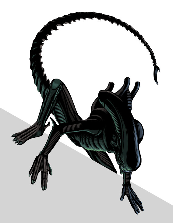
I’d recently started using dashed lines with uneven dashes and gaps to give areas some stylized texture or softened edges in assignments I was creating in Illustrator and I was looking forward to seeing how I could apply that technique to modeling the characters for this piece. I figured the best character to start on was the Alien—since it was going to be primarily in silhouette, a little modeling was going to go a long way and I could get an immediate impression of how well the technique would work without investing too much time and effort (in case it crashed and burned!)
After an hour, I knew I was going in the right direction—organizing the darks and lights into areas of relatively close tonal value helped to give the character volume and dimension while also maintaining the graphic, stylized look I was going for. I was able to quickly finish the Alien and get on to Kane in the egg chamber.
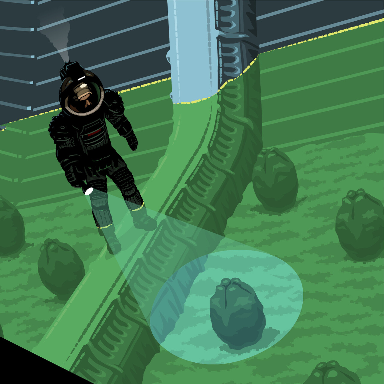
I was particularly looking forward to creating the final art for the egg chamber itself because I thought the uneven dashed lines could create some nice organic surface texture to the floor while still only needing to use 2 or 3 colors to do it. I still wasn’t sure how I was going to approach the interaction between the beam of Kane’s flashlight and the laser light surface above the eggs but I figured I would just figure that out while I was drawing it. Adding some transparency to the shapes creating the beam was all it ended up needing to feel like it integrated with the overall look of the image.
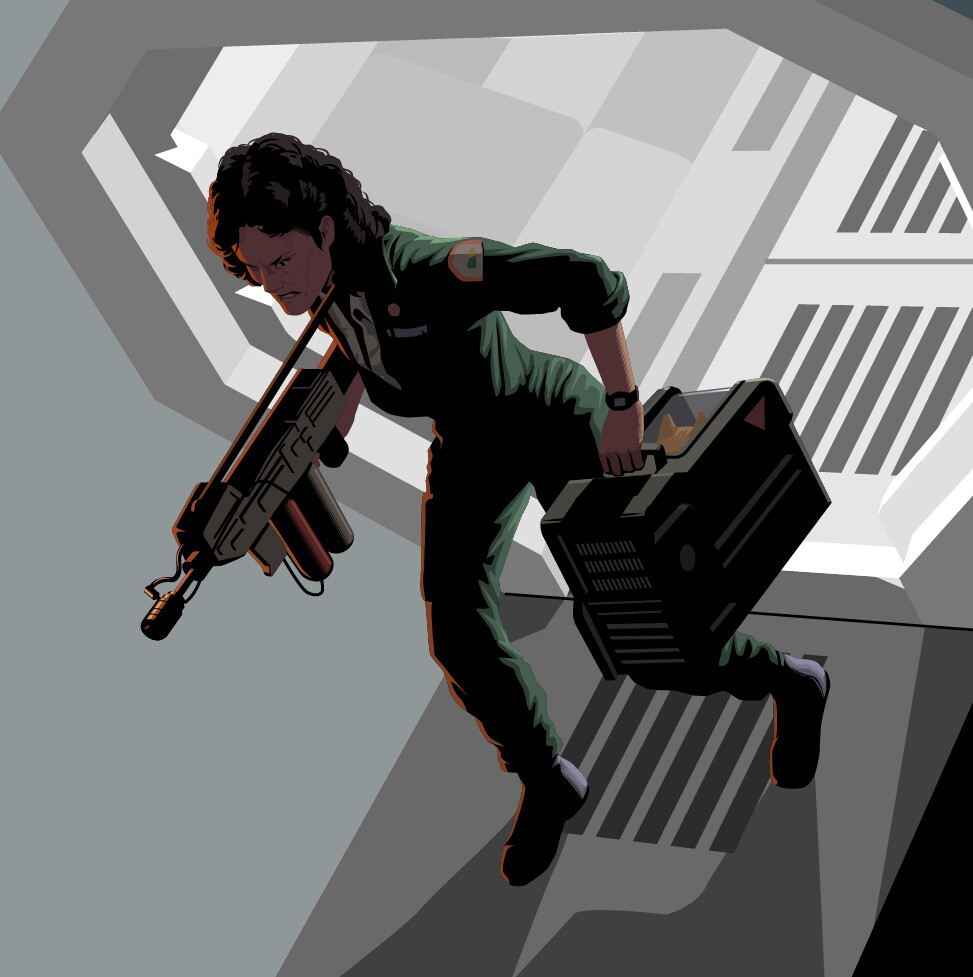
Ripley was the first “completely human” character I was going to work on—Kane was so obscured by his suit that I just had to add a hint of his face, but Ripley was going to be completely visible, though I still wanted to keep the overall tonal values dark. I’ve always thought of Alien as a horror movie so I wanted to keep the lighting on her as foreboding as possible. While Luke climbing the stairs is the figure I think leads your eye into the image, Ripley is the central figure and the point of greatest dark on light contrast, so it seemed to demand I add a lot of detail even though a lot of it might be “lost in the shadows”.
I worked on the characters at 4 times the size they would actually appear in the image which gave me a lot of room to add as much detail as was needed. I added each one to the final layout as I finished them, then got started on the Star Wars characters.


