When I started out creating the character sketches I was assuming they were simply going to serve the purpose of clarifying how the figures would look in the perspective they’d have in the final composition, but they ended up serving an even more important purpose in revealing the flaws in the basic structure of the larger image itself. This had already become apparent when I was drawing the Star Wars characters and continued on through drawing the characters from Star Trek.
With the Star Wars characters, the underlying flaws that were being revealed were more about how readable a given character would be from a given viewpoint and the problems became apparent almost as soon as I began to draw them. The problems the Star Trek characters revealed only became apparent after I drew them all and placed them in the larger image.
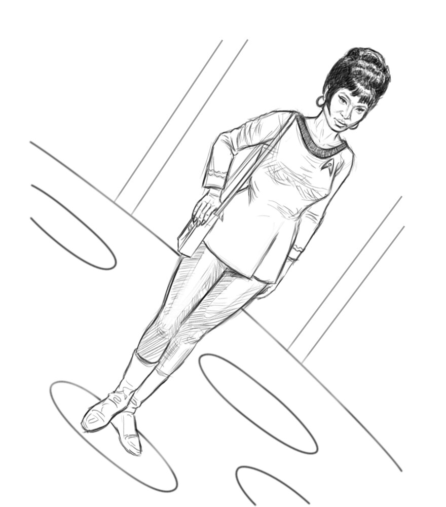
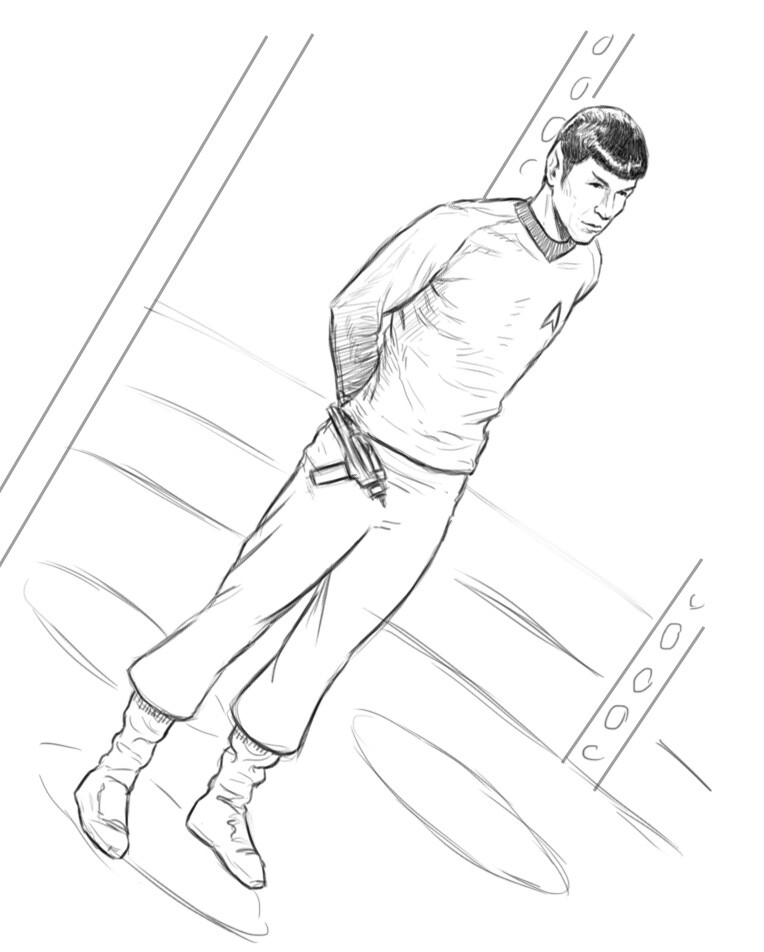
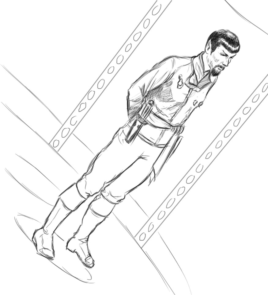
I started out being preoccupied with getting accurate likenesses of each character, which immediately felt like a higher priority for them than it had been for the Alien or Star Wars characters. The differences in the way characters are depicted in film as opposed to television (especially TV from the 60s, when color TV was still a relatively new technology) not only visually but in the balance between action and dialog, made handling the TV characters feel like a very different thing.
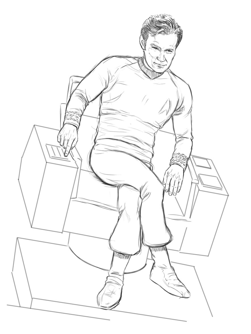
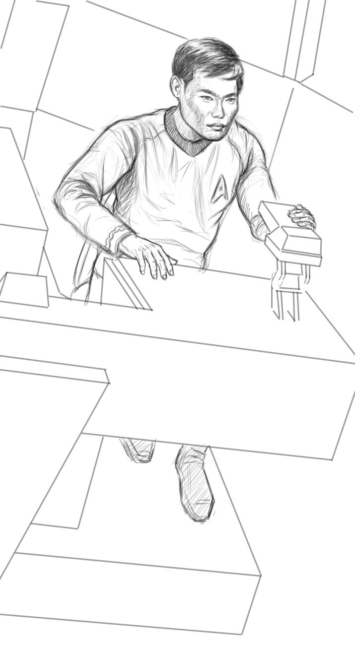
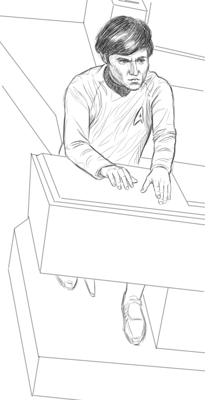
The poses of the Star Trek characters demanded to be far less dynamic than the Alien and Star Wars characters. So much of what goes on aboard the Enterprise in the original series happens primarily through dialog—it’s only when they beam down to a planet surface that all the Vulcan pinching and Kirk Fu goes on. The archetypal Enterprise bridge or transporter room sequences both always seemed to be very still (the transporter room especially, since they had to use a still image to create the transporter VFX.)
The other huge difference that didn’t have immediate implications, since I was still drawing sketches in B&W but was already starting to itch at the back of my mind, was the difference between cinematic lighting and 60s TV lighting. The lighting from that period of television history had to be relatively uniform, where film could use light in a complete tonal range—you could go from silhouettes to floodlights and everything in between in film and use it to create depth and volume as well as atmosphere. With TV lighting at that time, it was a challenge just to get everything to “read” on the screens that were available at the time. The lighting, costume and scenic designers on shows like Star Trek and Batman did some absolutely ingenious things to get as much out of their resources as they could.
The contrast between the TV and movie worlds wasn’t really a problem—if anything, it was going to serve to clarify what character came from which world in the final image—but I still wanted everything to harmonize as a whole, so integrating everything into a nice visual rhythm was going to take some doing.
I ended up being relatively happy with the drawings of the Star Trek characters themselves, but adding them to the final image forced me to confront the fact that the underlying structure just wasn’t working as well as it needed to. I was going to have to go back and tinker with the original layout now that drawing the characters gave me a clearer idea of where everything and everyone needed to be.