Now that I had all the preliminary character sketches completed, it was time to add them all to the main layout and see what I was working with.
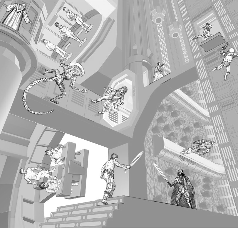
My previous doubts that started with the Star Trek and Star Wars characters ended up being confirmed when I put everything in place. The first thing I noticed was the relative scale of the characters to the overall layout was way too small. I started this project knowing that the environment itself was going to be the star of the show and there was going to be some inherent strangeness to seeing characters that are usually depicted as epic and larger-than-life as possible reduced to the relative size of action figures in a playset but they immediately felt too small for the space. Rather than looking like they were at home in their environment, all of the characters seemed to be dangling off arbitrary surfaces with no visual rhythm to the poses, something that wasn’t immediately obvious when I was drawing each of them in isolation.
The straight-ahead orientation of the Star Trek bridge led to awkward foreshortening that had already been bothering me when I was doing the character sketches but was made even worse when I saw it in context. The space for the transporter room ended up being quite a bit larger than the actual transporter room needed to be so the characters were floating around in a space that diminished their importance.
I realized switching the locations of the two Star Trek regions would go a long way to solving both problems simultaneously—putting the transporter in the lower left corner would tighten up the space, enlarging the relative size of the characters and giving a head-on view more appropriate to the “beaming down” effect I wanted to use. Having the bridge at the top of the image would have it facing more toward the central axis of the image, giving some impression of movement in a definite direction, even though everybody would still be sitting down.
This layout confirmed my intention to move the Death Star tractor beam—the transition between it and the Star Trek bridge was the most awkward space in the entire image. Moving it to the opposite side was going to help reduce the amount of Death Star wall lights as well, which were taking up a little too much space.
As bad as the relative scale of the characters was overall, it was even worse with Princess Leia and the stormtroopers in the upper right corner. They were being dwarfed by the space in a way that diminished any excitement I could get out of them.
The confrontation between Ripley and the Alien didn’t feel right, either. Being that close to the Alien should have had more drama—the way I had it had them looking they were saying “Oh—YOU’RE here” to each other, like they were running into an ex at a restaurant. I needed to add some dynamism and some distance to them.
Luke’s confrontation with Vader seemed like it was getting there, but Vader’s pose didn’t feel Vader-y enough to me yet.
I had to go back to the drawing board with EVERYTHING.