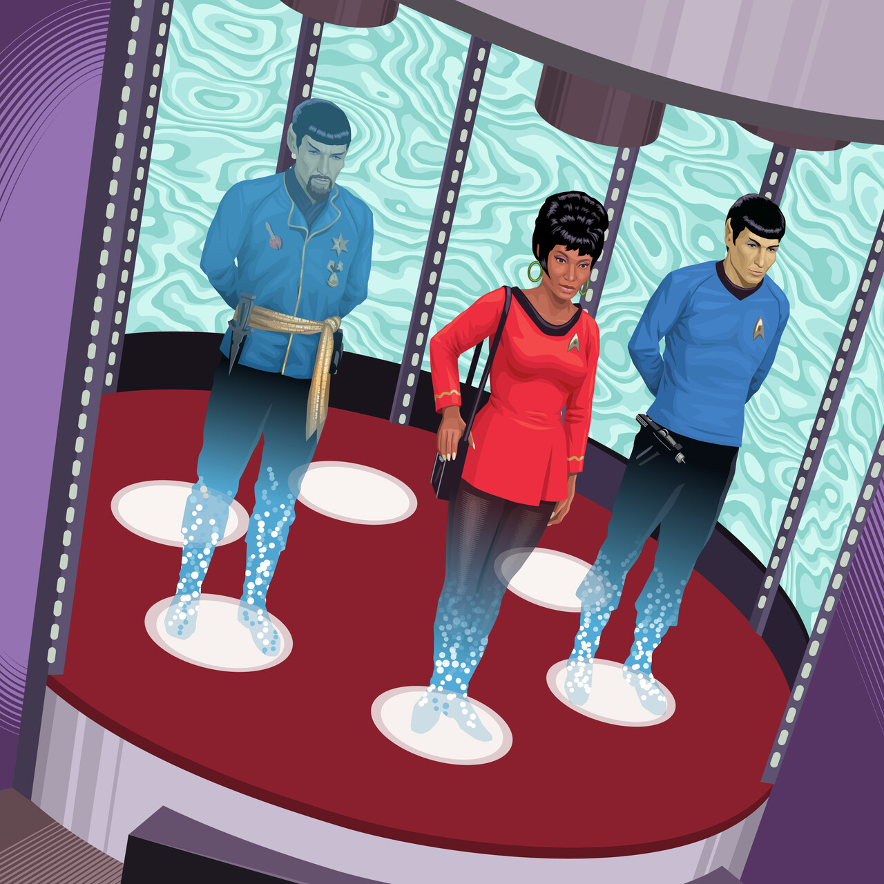
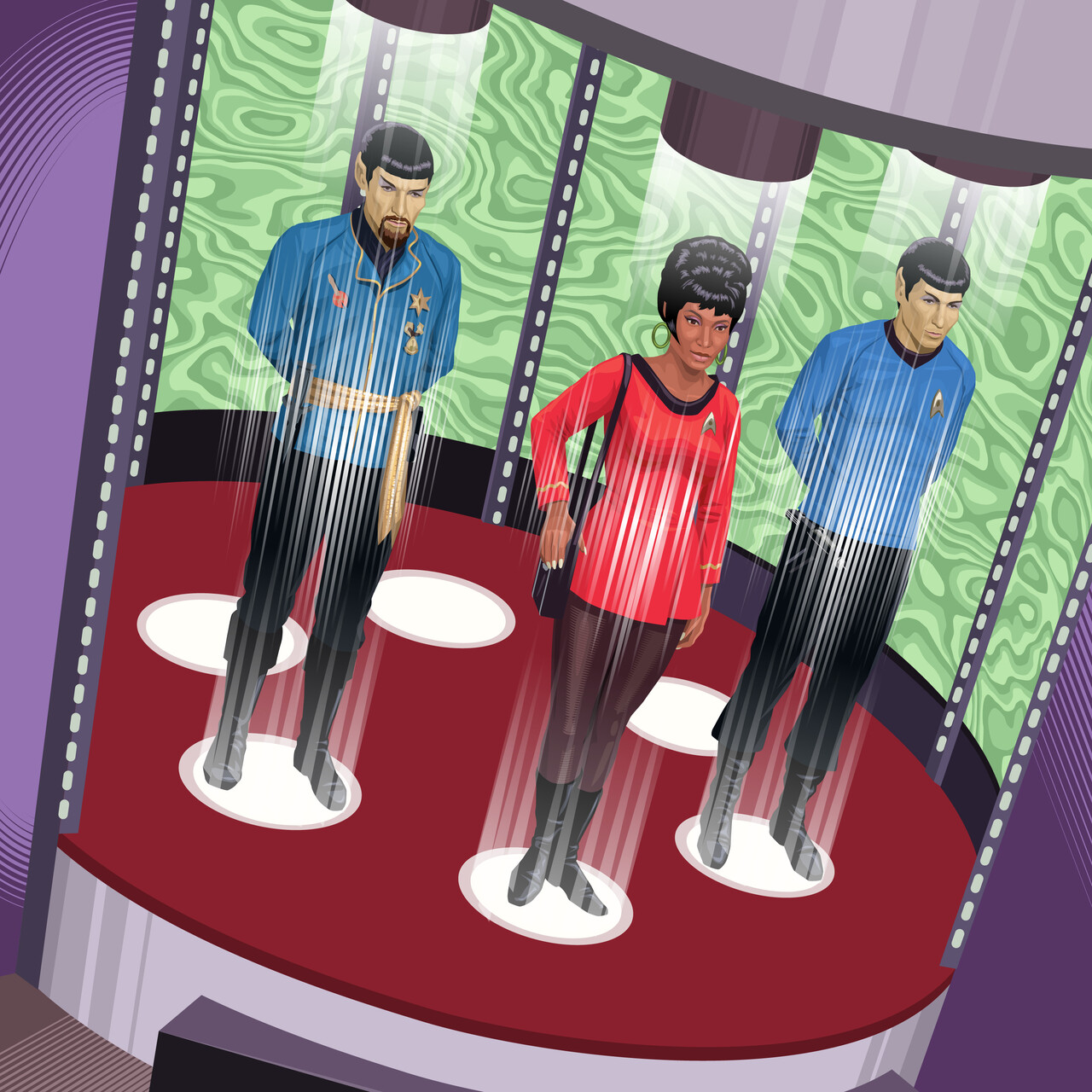
The stylization I was using worked well with the figures up to this point. Since so many of them were almost in silhouette, adding a few isolated patches of light around their edges were all they’d needed to give them some volume. Leia and the stormtrooper had been the only light-on-light figures and they’d given me some clues as to how to approach the characters from Star Trek.
Star Trek’s original production design had essentially solved all my problems for me because the vibrant colors and iconic designs of the uniforms and sets lent themselves to a graphic treatment. As far as the figures were concerned, I was starting out with sketches I liked so I felt confident I could capture passable likenesses of all the characters. The big question I had was how I was going to approach creating the transporter effect in a stylized, graphic way.
My first attempt was to try to reproduce the look of the original effect, which used backlit aluminum powder shot upside down. It completely fizzled—they looked like they were wearing weird leggings.
I decided to try something more emphatically linear—maybe not as accurate or in keeping with the effect of the original show but something that looked better-suited to the image. Some tapering, transparent lines still seemed to give the impression of “beaming up” while emphasizing the underlying linear perspective. The groovy lava lamp background would be a nice balance to the Alien egg chamber on the other side of the image once I got everything in place.
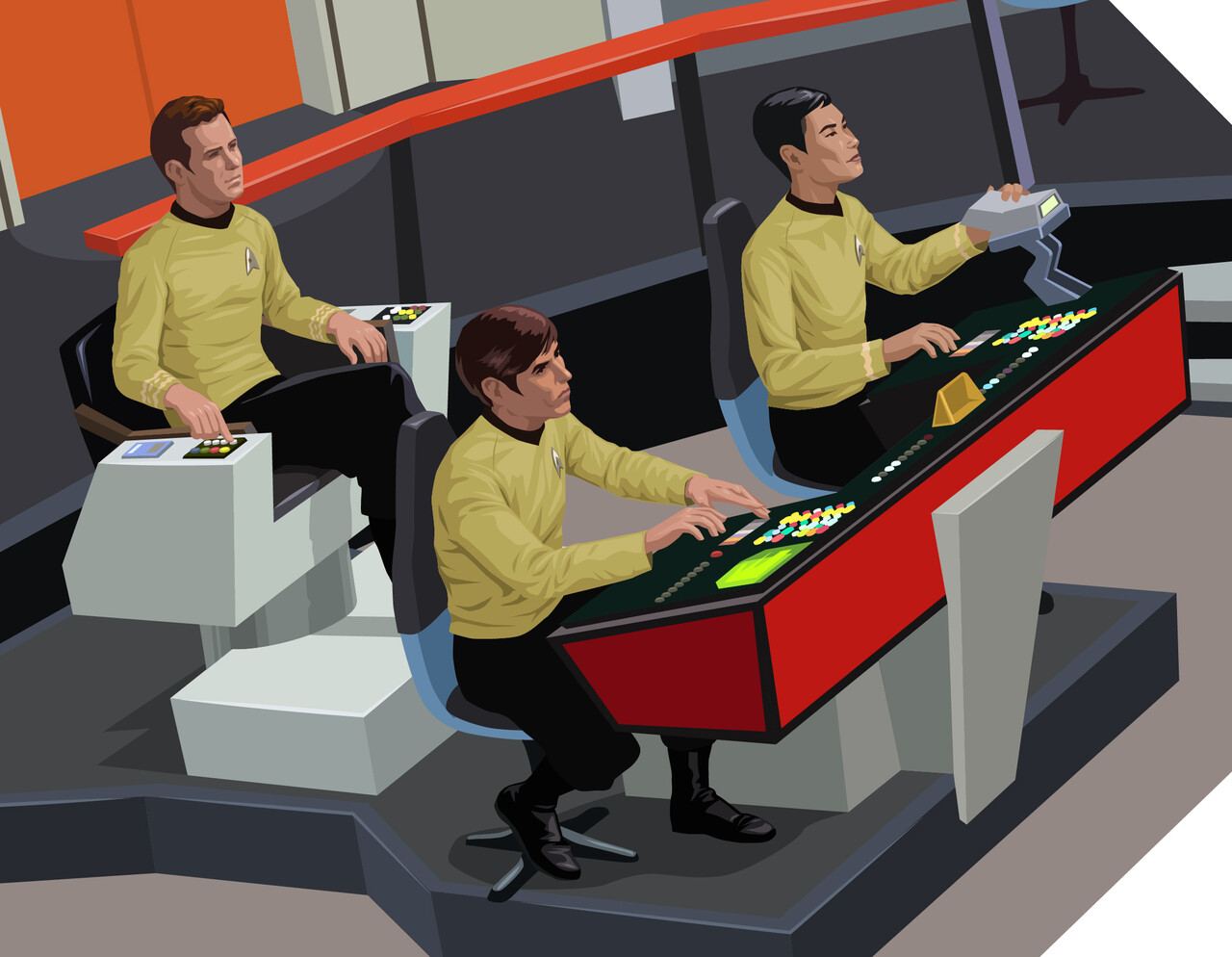
The bridge was relatively straightforward, a mass of tiny details and concentric rings in perspective. The most awkward thing about it was giving Chekov enough room to sit at his position, but that seemed to be i keeping with the original show—most of the reference I studied showed his chair barely staying on the platform.
I was in the home stretch! Most of the heavy lifting had been done and it was now a matter of getting everything together and adding the finishing touches.


