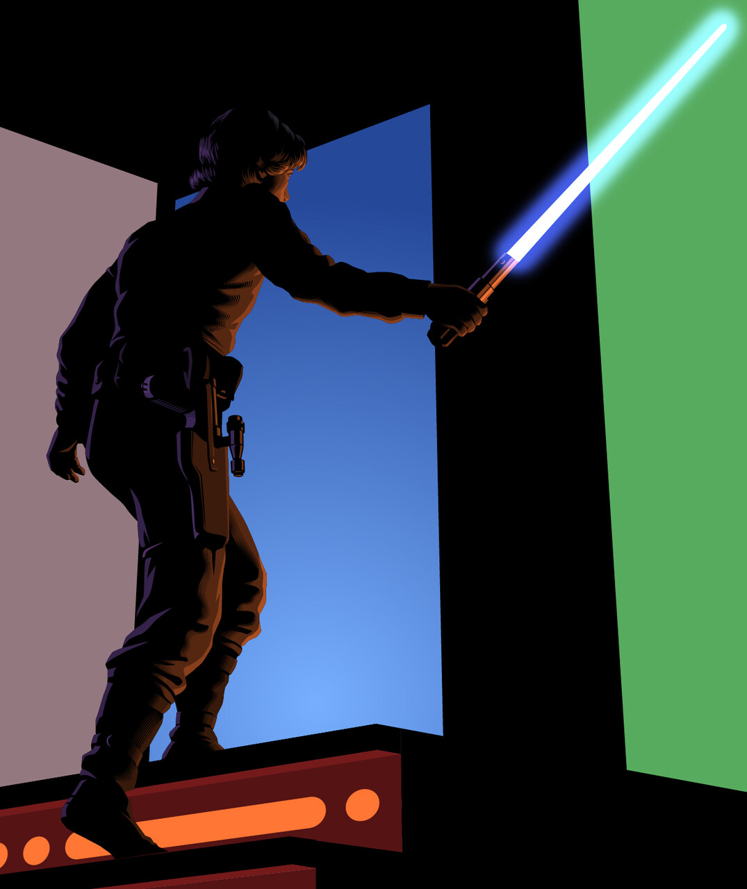
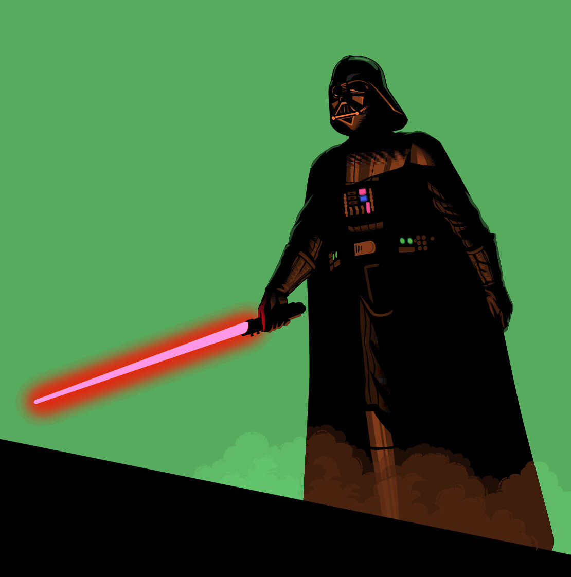
Creating the final art for the Alien characters really helped to clarify the approach I was going to take for the rest of the figures, especially for Luke and Vader: they were going to be primarily in silhouette, so I knew the same kind of modeling I’d used on the Alien would work on them, the only difference being that the light was going to be orange rather than the green I’d used for the Alien characters.
There were a number of different ways I could handle the effect for the lightsabers but I wanted to make sure they integrated well with the overall design of the rest of the image. I could easily make a subtle glow effect in Photoshop that looked like it came out fo the film but it would look out of place with the graphic look of the rest of the image. I ended up using Photoshop to create a “hard light” glow (pictured) that I could use as a color reference for the final art in Illustrator. I was able to create a lightsaber effect that fit well in the image using just three or four colors with no need for blends or gradients.
I really wanted to keep everything as dark as possible on Vader, but loved being able to add the lights on all his “machinery”—they keep the figure from flattening out by implying all the underlying stuff without having to actually show it.
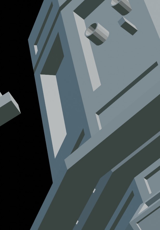
Filling in the detail on the tractor beam tower ended up being a challenge because there were a lot of buttons and sci-fi doodads that come off diagonal surfaces that had to be drawn from an extremely low horizon line. I went back into Blender and added some simple cylinders and spheres where they needed to, then brought it back into Illustrator to flesh out.
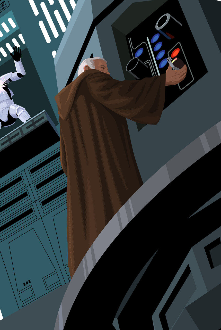
Ben's robe gave me a great opportunity to use the staggered dash line technique I used to soften the edges of shadows and give some areas a graphic texture.
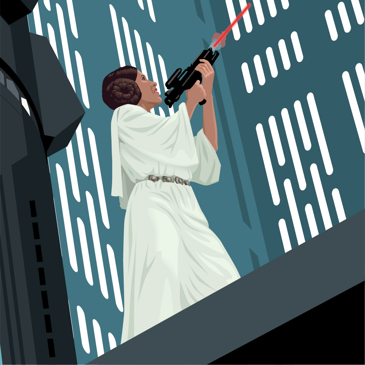
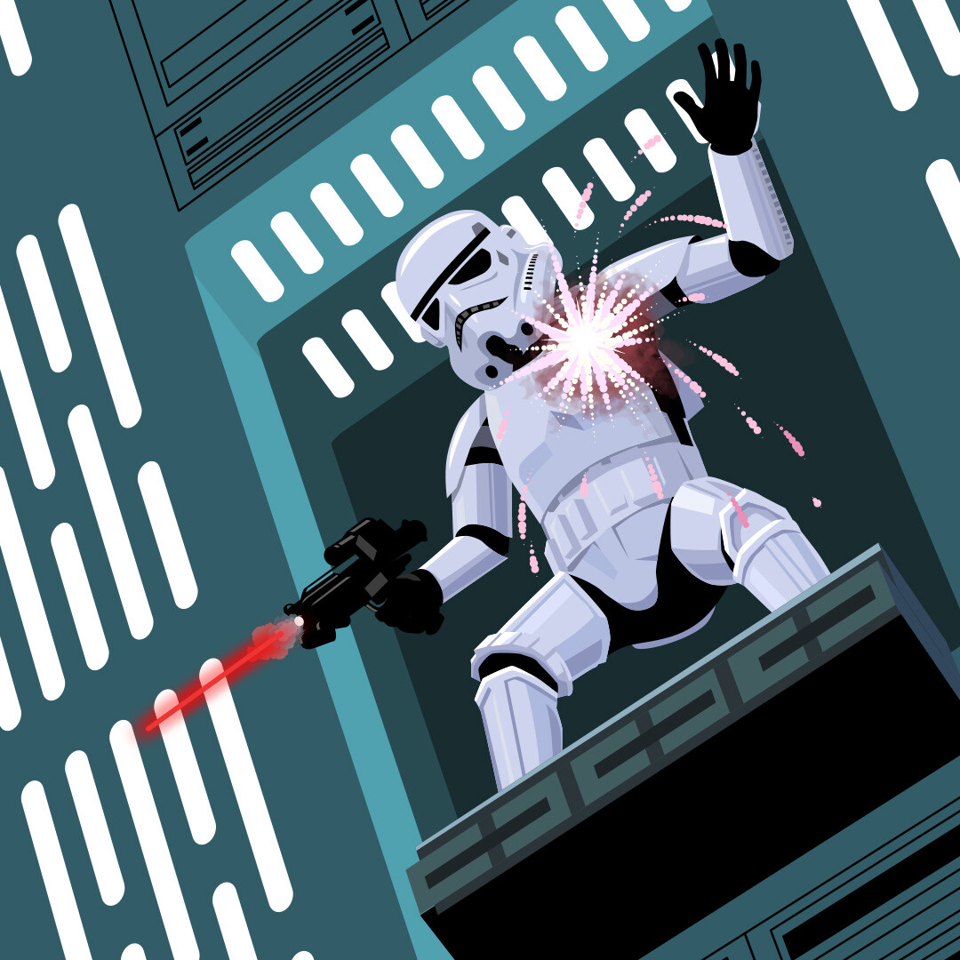
Leia and the stormtrooper gave me a new thing to think about—they were the first figures I was dealing with that weren’t going to be primarily silhouettes. To make it even more of a challenge, the background they’d be seen against was the most light-saturated area of the image. And they’re both wearing white. Creating the final art for them started to feel like the old joke about a blank sheet of paper really being a drawing of a polar bear in a snowstorm with its eyes closed.
I still had some opportunities to introduce some dark areas like the blasters they’re using, Leia’s hair (seeing her in profile gave me the chance to show more of it than I’d be able to with a more front-facing pose) and the black suit under the stormtrooper’s armor that could be seen at the joints. I tried adding a blaster hit to the stormtrooper in the large image but ended up removing it when I put him in place on the final image—the stylization made it look way too much like fireworks.
The experience visually problem-solving the light-on-light Star Wars characters helped me to start thinking of the way I would handle the Star Trek characters. The “TV lighting” of the Star Trek areas of the image was going to demand a lot more modeling than the predominantly dark-on-light figures I’d used from the movies.
