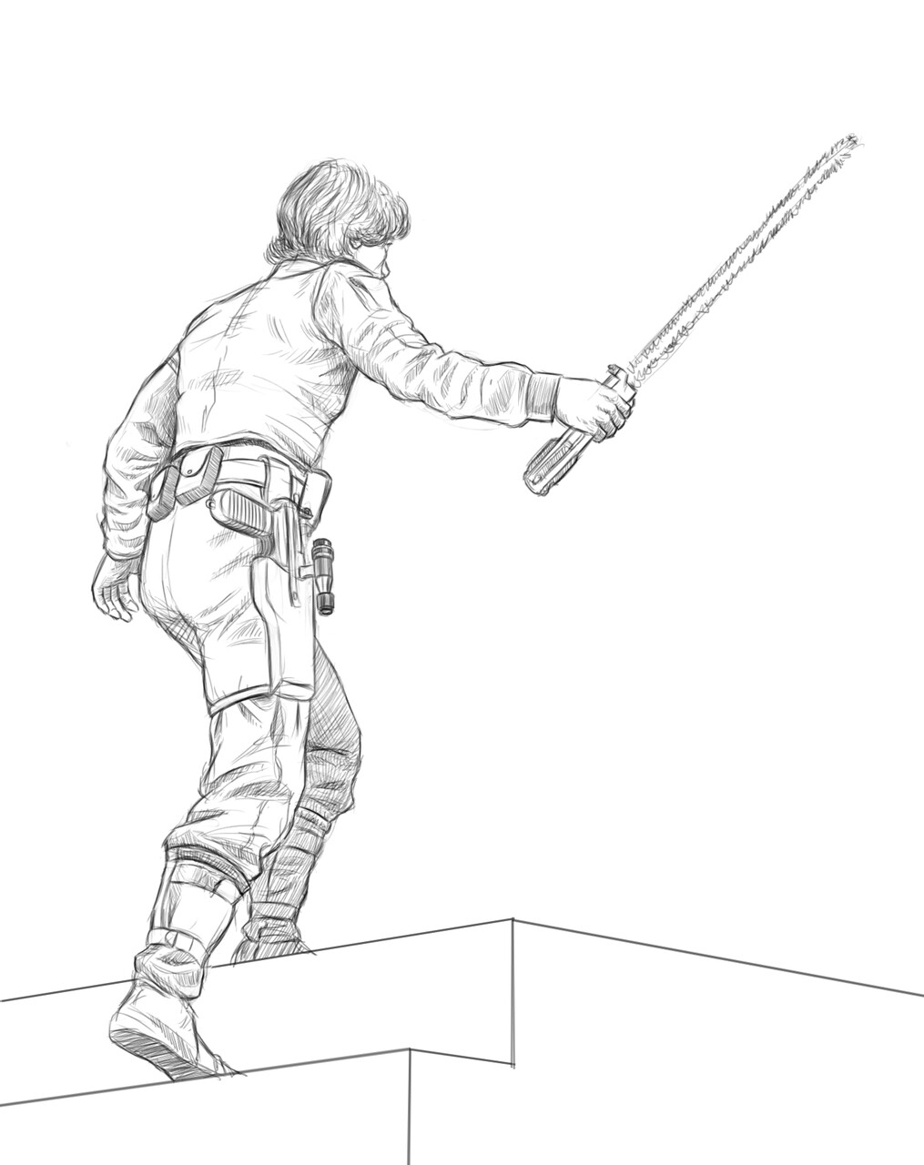
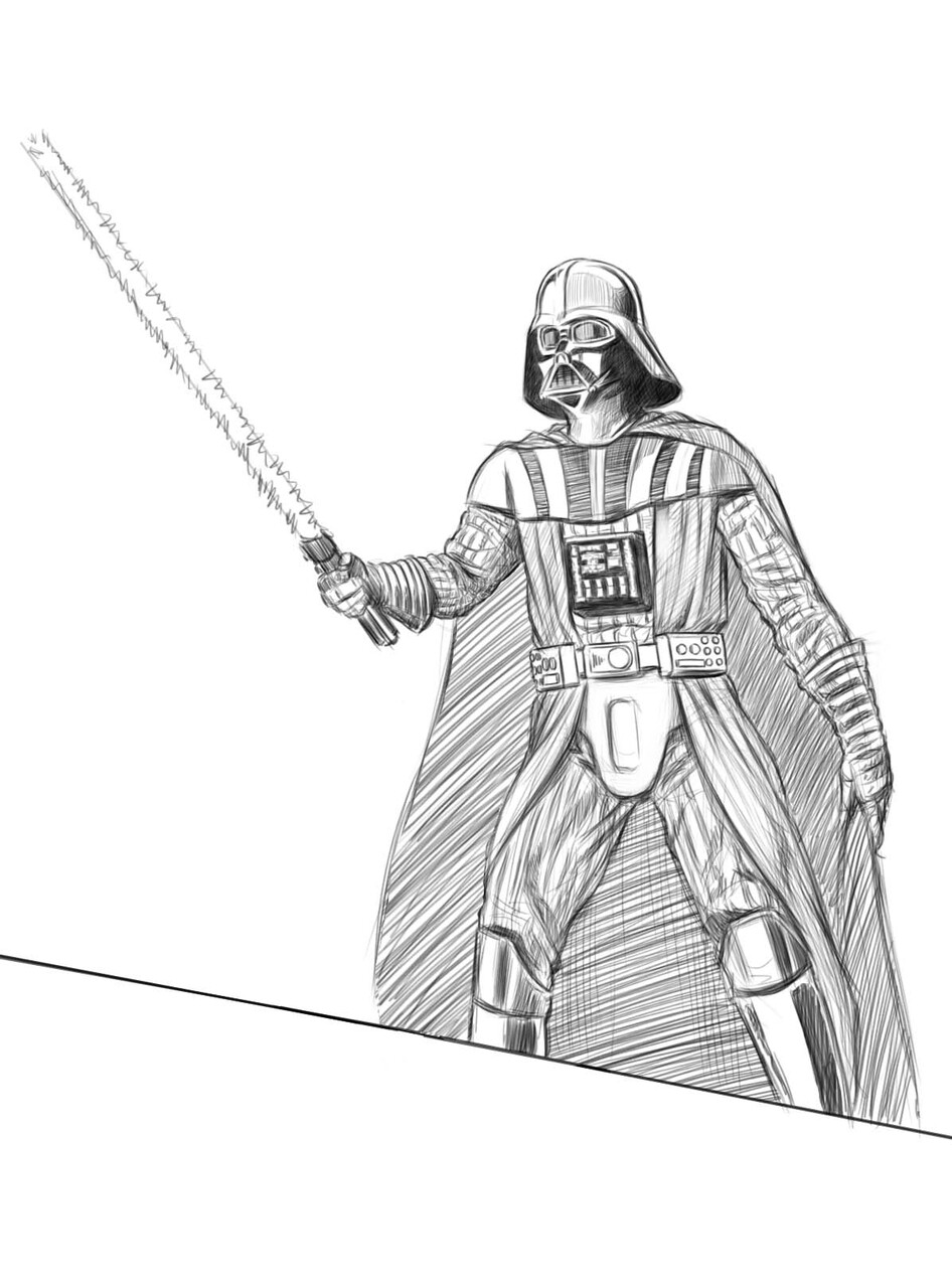
Creating sketches for the Star Wars characters was about as straightforward a process as it was for the Alien characters, though I still had some uncertainty as to how I was going to handle the placement of the tractor beam and even how many times I was going to use a character.
My original conception had been to show Luke twice in the same image (a holdover from when I was first conceptualizing the image and thought about showing one event from 3 different angles at once), showing him walking up the stairs for his duel with Vader and also swinging with Leia across the Death Star chasm, but the placement of the Death Star chasm in the image made the character posing too awkward for me to use the idea—Luke and Leia would be seen from some such an extremely low angle that it would be almost impossible to read what was going on. It ended up being addition by subtraction; using a character twice seemed like space that could be better used for another character, so I decided to use the Death Star chasm as a showcase for Leia shooting stormtroopers.
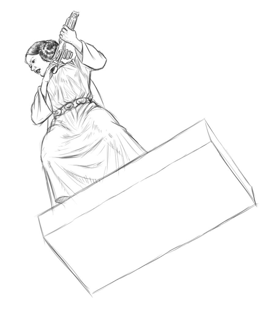
I originally wanted to have Leia standing on the platform nub that the walkway across the chasm shoots out from. It was a nice, dramatic angle that was going to give me the opportunity to draw her from an interesting vantage point with a lot of foreshortening. A couple of stormtroopers would be advancing toward her along another walkway.
This seemed like a workable idea in the thumbnail stage but working up more fully-realized drawings soon showed that the way the space was designed was going to make it difficult to show everybody shooting in the directions they were going to need to be shooting.
While I liked the drawings individually, they showed me that I was going to have to go back to the drawing board and figure out exactly what I wanted to do with the space on the Death Star part of the image before I could start populating it with characters.
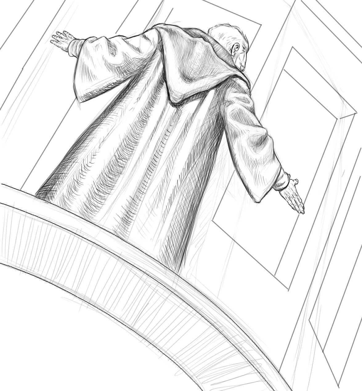
One of the moments that had stayed with me from the very first thumbnail I drew on this project was showing Ben Kenobi turning off the tractor beam. I was always thinking of placing him in a dark corner to make him seem as stealthy and surreptitious as the moment in the actual movie, but I still wasn’t sure if I’d picked the right corner. I managed to wrestle my way through some preliminary attempts at fitting the tractor beam into the upper left corner but it still wasn’t settling in for me. I was hoping working on the character sketch could give me a better idea of whether or not the idea would work at all.
I discovered another new challenge the second I started Ben’s character sketch: his robe was going to make him very hard to read as a figure in the extreme foreshortening that I was going to have to use in that part of the image. Getting even a sliver of his face to be visible behind his shoulders and the lowered hood that protruded out from behind his robe wasn’t going to be easy. I managed to come up with a pose I liked and the drapery study of his robe was a worthwhile thing to explore but, just as with Leia and the stormtoopers (which would make a great band name, btw) Ben’s character sketch revealed a weakness in the design of the space in that part of the image that was going to have to be addressed before I could start adding figures to it.


